
How to Choose Face and Core Colors for 2-Ply Engraving Plastic
How to Choose Face and Core Colors for 2-Ply Engraving Plastic
A 2-ply engraving plastic sheet creates its message by removing a thin face layer and exposing a differently colored core. Choosing that color pair is therefore a functional decision: it affects how quickly text can be recognized, how the sign behaves under light and whether a finished label matches the buyer's approved design.
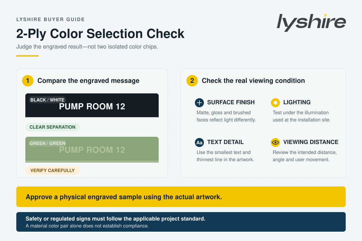
Quick answer: Specify the face color, core color and surface finish together. Then engrave the intended font, line width and symbol size on a physical sample and inspect it at the expected distance, angle and lighting. A color chart or screen image cannot replace this test.
Why the face/core pair is part of the specification
In surface engraving, the machine removes selected areas of the cap or face layer so that the core becomes the visible text, number, border or pictogram. Industry material references describe this as the basic contrast mechanism of two-layer engraving stock. However, “two different colors” does not automatically mean “easy to read.” A pale green face over a slightly lighter green core may technically reveal the second layer but still provide weak visual separation.
The correct pair depends on the message and its environment. A machine nameplate read from arm's length, a room-identification sign viewed while walking, a small electrical terminal marker and a decorative award plate do not have the same reading conditions. Buyers should define the job first and select the 2-ply engraving plastic color pair second.
Five checks that determine practical readability
1. Light-on-dark or dark-on-light separation
Strong light/dark separation is usually the safest starting point for information that must be recognized quickly. Common examples include white characters on black, black characters on white, white on dark blue and black on yellow. The U.S. Access Board's sign guidance similarly uses light characters on a dark background or dark characters on a light background as the basic contrast principle for covered visual signs.
This does not mean every industrial label is governed by accessibility rules, and the guidance does not establish one universal numeric contrast value for every engraving application. It does show why visual separation should be evaluated before aesthetic preference. Where a sign is subject to a regulation, drawing or customer standard, that specific requirement takes priority.
2. Surface finish and glare
Matte, gloss, brushed and mirror-effect faces can present the same nominal color differently. Gloss and metallic reflections may reduce apparent contrast at certain viewing angles, particularly near windows, overhead lights or strong directional lighting. A combination that looks clear in a catalog may become harder to read when the surface reflects a bright source.
For functional identification, test the final finish under the real installation lighting. If the sign is intended for accessible visual communication, applicable requirements may also call for a non-glare finish. Do not assume that a high-contrast color pair automatically resolves a glare problem.
3. Character size, stroke width and engraving detail
Color contrast cannot compensate for characters that are too small or strokes that are too thin for the viewing distance and process. Fine fonts, narrow counters and tightly spaced lines can lose definition if the engraving depth, laser spot, rotary cutter or artwork is not matched to the material. Buyers should send actual artwork rather than approving color from a blank swatch alone.
4. Viewing distance, angle and movement
A label inspected at 20 centimeters on a desk may perform differently when installed two meters away, above eye level or beside moving equipment. Record the expected observation distance and whether users will read the message while stationary or moving. A physical mock-up installed temporarily at the target location is often the most reliable approval method for wayfinding and larger operational signs.
5. Ambient color and contamination
The surrounding panel color can affect how the complete label is perceived. Dust, oils and frequent cleaning may also reduce visibility even when the original pair was clear. This does not make one polymer or color automatically suitable for every environment; service conditions, chemical exposure and cleaning method must be checked against the exact material grade.
Color-pair priorities by application
| Application | Primary color decision | What to verify |
|---|---|---|
| Equipment nameplates | Fast recognition of identifiers and operating text | Fine characters, panel lighting, viewing angle and resistance required by the project |
| Control-panel legends | Consistent grouping and distinction between controls | Actual button spacing, small text, face/core orientation and cleaning conditions |
| Wayfinding and room signs | Clear light/dark separation and controlled glare | Viewing distance, character requirements, finish and any applicable accessibility rules |
| Safety or warning labels | Compliance with the mandated signal-color system | Applicable regulation, approved artwork, wording, placement and material performance |
| Brand and decorative plates | Approved brand appearance without losing the message | Physical color sample, surface texture, lighting and acceptable contrast at close range |
Important: red, yellow, orange and green can carry defined safety meanings in regulated workplaces. Do not select a safety-label color combination only because it is visually attractive. OSHA, local regulations, customer standards and the equipment risk assessment may control the required colors and wording.
Face color, core color and orientation must not be reversed
“Black/white” normally means a black face with a white core, so engraving produces white characters. “White/black” is a different product: the face is white and the exposed message is black. Both combinations may be readable, but they create opposite visual results. A purchase order should name the face first and core second, or state the intended result explicitly—for example, “black background with engraved white text.”
For metallic and special-effect materials, the same rule applies. “Brushed silver/black” identifies a brushed silver face over a black core. The brushing direction should also be confirmed when visual consistency matters. A reference photograph is helpful, but production approval should use a physical sample because screens and lighting can alter color appearance.
Match the color decision to the processing route
The pair is only one part of the order. LYSHIRE separates PMMA/acrylic-based material intended for CO2 laser work from standard ABS material directed to CNC or rotary engraving. Buyers should not select a color from one route and assume that the identical construction, finish or behavior is automatically available in the other route.
Confirm the machine and process before final color approval. Laser projects should be sampled with the intended laser settings, while CNC or rotary projects should be tested with the proposed cutter, depth and tool path. For a broader material comparison, review the LYSHIRE processing system and laser engraving sheet range.
A practical buyer approval sequence
- Define the message: identify whether the part is informational, operational, safety-related, accessible or decorative.
- State the viewing condition: provide distance, angle, lighting and whether glare is a concern.
- Name both colors: write face/core order clearly and include an approved code or physical reference when color matching is required.
- Confirm the finish: choose matte, gloss, brushed, mirror or another available surface separately from the basic color name.
- Provide real artwork: include font, smallest text, thinnest line, pictograms and any variable data.
- Confirm material and process: identify CO2 laser, CNC or rotary engraving and the required sheet thickness.
- Engrave a representative sample: use the planned process and inspect it in the installation environment.
- Keep an approved reference: retain the signed sample or controlled specification for later production and batch comparison.
What to include in an RFQ
A complete 2-ply engraving plastic request should include the application, face color, core color, surface finish, base material or processing route, thickness, sheet or finished-part size, artwork, service environment and quantity. LYSHIRE's common sheet thicknesses include 1.3 mm and 1.5 mm, with a broader current production range of 0.1-3.0 mm depending on construction and project requirements.
The standard MOQ is 500 sheets and standard colors may be mixed, subject to order confirmation and packing multiples. Mixed colors help buyers build a practical range, but every selected face/core combination should still be listed separately. Custom colors require additional feasibility, reference-standard and quantity review.
For two-ply, three-ply, reverse and double-sided structures, see the LYSHIRE engraving sheet structure system. Finished labels, holes, rounded corners, special shapes and other conversion requirements can be discussed through the custom application service.
Frequently Asked Questions
Is black/white always the best two-ply color combination?
No. It is a common high-separation pair, but the correct choice depends on the application, lighting, viewing distance, applicable standard and approved design.
Can two similar colors be used?
They can be considered for close-view decorative work, but weak separation may be unsuitable for operational, wayfinding or safety information. Test the real engraved artwork first.
Does a glossy surface reduce readability?
Not in every installation, but reflections can reduce apparent contrast at particular angles. Inspect the final gloss or metallic finish under the intended lighting.
Can a digital color chart approve the order?
A digital chart is useful for initial selection, not final color control. Screen calibration, photography and lighting can change appearance, so use a physical sample when color is critical.
Does light text on a dark background automatically make a sign compliant?
No. Contrast is only one factor. Applicable rules may also control finish, character form, size, spacing, mounting location, wording, symbols and material performance.
Can several standard color combinations be mixed in one order?
LYSHIRE's standard MOQ is 500 sheets and standard colors may be mixed, subject to order confirmation, availability and packing multiples. List each required combination and quantity in the RFQ.
Request a Face/Core Color Review
Send LYSHIRE the application, processing method, color orientation, finish, artwork, thickness and quantity. The team can help identify suitable standard options and arrange a representative sample for evaluation.
Contact LYSHIRETechnical references: Trotec two-layer engraving plastic description, Gravotech engraving material guidance, U.S. Access Board sign contrast guidance and OSHA accident-prevention sign requirements.