
How to Choose Color Contrast for Two-Color Engraved Signs
Face and Core Color Selection
How to Choose Color Contrast for Two-Color Engraved Signs
Two-color engraving plastic creates information by removing a thin face and exposing a contrasting core. Choosing the right pair is not simply a matter of selecting two attractive colors. Buyers should review light–dark difference, surface glare, character size, viewing distance, installation lighting, color meaning and the rules that apply to the finished sign.
Direct answer: begin with a clearly light-on-dark or dark-on-light physical sample, then test the smallest required text at the farthest normal viewing position under the actual lighting. Prefer a non-glare finish when visual readability is critical. For safety, accessibility or regulated signs, apply the required standard before choosing from the supplier’s color range.
Contrast Is a System
Five Variables Determine Whether the Sign Is Easy to Read
Light–Dark Difference
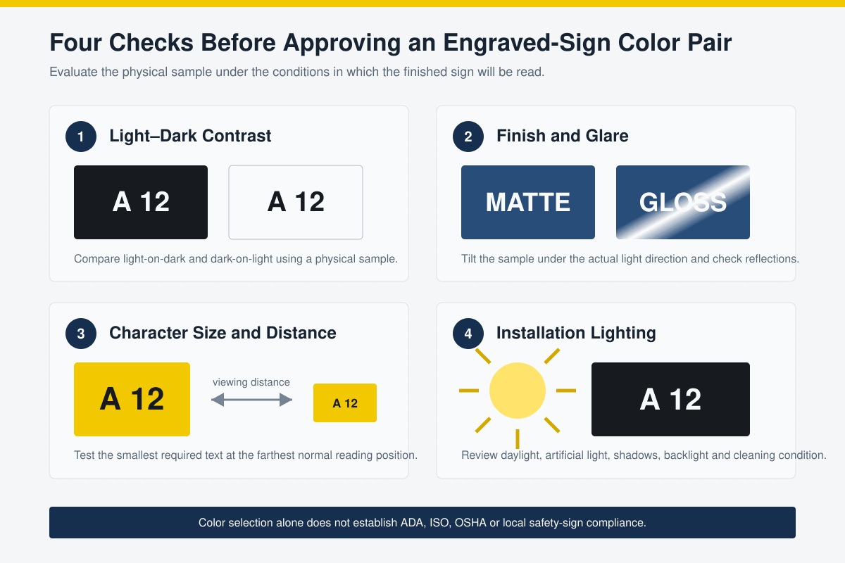
The face and revealed core should remain visually separate. Two different hues can still have similar apparent brightness and weak readability.
Surface Finish
Matte or non-glare surfaces usually remain more stable under changing viewing angles. Gloss, mirror and metallic finishes can reflect the light source.
Character Design
Character height, stroke width, spacing, font, symbols and line density affect clarity as much as the color pair.
Viewing Conditions
Distance, angle, daylight, shadows, backlighting, dirt and artificial illumination can change how the same sample appears.
Meaning and Compliance
Red, yellow, green and blue may carry prescribed safety meanings. A visually strong pair is not automatically a compliant sign system.
Processing Quality
Incomplete face removal, excess depth, residue or inconsistent engraving can reduce contrast even when the selected colors are suitable.
Start with Polarity
Compare Light-on-Dark and Dark-on-Light
Black/white and white/black are useful starting pairs because the face and core sit at opposite ends of the light–dark range. They do not produce identical visual behavior. A dark background with light information can feel compact and reduce the amount of bright surface, while a light background with dark information may appear more open and familiar in well-lit spaces.
There is no universal rule that one polarity is always more readable. The correct choice depends on text size, illumination, sign area, viewing distance, nearby surfaces and user needs. Review both physical samples rather than reversing a digital design and assuming the result will be equivalent.
Common Starting Combinations
How Buyers Can Shortlist Face and Core Colors
| Face/core example | General visual characteristic | What must still be confirmed |
|---|---|---|
| Black / white | Strong light information on a dark background; widely used for equipment and general identification. | Finish, smallest text, cleaning condition and whether the project requires another prescribed color. |
| White / black | Strong dark information on a light background; familiar for many labels and directories. | Glare, surface marking, surrounding brightness and the total amount of white field. |
| Yellow / black | Attention-getting dark-on-light pairing with strong apparent separation. | Whether yellow/black has a required caution or hazard meaning under the applicable sign standard. |
| Red / white | Visually prominent light-on-red pairing used in branding and some identification systems. | Whether red is reserved for danger, stop, fire or another defined function in the jurisdiction. |
| Blue / white | Clear light-on-color combination often selected for information, instruction or corporate systems. | Exact color standard, ambient light, local safety meaning and visual consistency across the site. |
| Green / white | Recognizable light-on-color combination that can fit general identification or approved safety systems. | Emergency, first-aid or safe-condition meanings that may apply to regulated signage. |
| Grey / light grey | Subtle appearance for decorative or low-priority information. | Whether contrast remains sufficient at distance, under low light or for users with reduced vision. |
These are material-selection starting points, not permission to assign a safety meaning. The sign designer must apply the correct standard, layout, symbol, wording and color specification for the project.
Finish and Glare
High Color Contrast Can Still Fail under Reflection
A high-gloss black/white sign may show strong contrast in a product photograph yet become difficult to read when a ceiling light or window reflects directly toward the viewer. Mirror, brushed metallic and patterned finishes can create the same problem at particular angles.
For information that must remain readable across different positions, compare a matte or non-glare option with the decorative finish. Tilt the physical sample toward the expected light sources and review it from standing, seated and side angles where relevant. If a protective cover will be installed, test the complete assembly because the cover can introduce new reflections.
Accessibility Boundary
U.S. ADA guidance for visual characters requires a non-glare finish and either light characters on a dark background or dark characters on a light background. It does not set one minimum numeric contrast level for every covered sign. The complete sign must meet all applicable requirements—not only finish and color.
Character Size and Distance
Test the Finished Artwork, Not Only a Large Color Swatch
Large color blocks can look clearly different while small engraved text appears weak. Fine lines expose less core area, and narrow strokes are more sensitive to depth, focus, residue and viewing distance. A color pair should therefore be evaluated using the smallest real text, thinnest line, icons and codes required by the project.
Print or engrave the artwork at final size, install it at the planned height and review it from the farthest normal position. Check whether the sign remains readable without relying on memorized wording. For regulated signs, use the character height, stroke, spacing and mounting rules specified by the applicable standard.
Lighting and Environment
The Same Pair Can Change between the Sample Room and the Site
| Strong daylight | Check glare, reflection, shadows and whether surrounding bright surfaces reduce the apparent separation. |
| Low indoor light | Mid-tone combinations may merge. Test at the lowest normal operating light level. |
| Colored artificial light | Some LEDs or industrial lamps can shift the appearance of red, blue, green and metallic finishes. |
| Outdoor exposure | Confirm the exact material’s UV and weather suitability; contrast at installation does not guarantee long-term color retention. |
| Dust, oil or cleaning | Surface contamination can reduce contrast or add gloss. Validate cleaning agents and maintenance practices. |
| Backlight or protective cover | Review the complete assembled sign because light transmission and cover reflection can change the visual result. |
Color Vision and Redundancy
Do Not Make Color the Only Carrier of Critical Information
Some users distinguish certain color combinations less easily than others. When information affects safety, operation or navigation, reinforce color with clear wording, symbols, shapes, position or another approved code. Red versus green alone, for example, should not be the only difference between two critical states.
This does not mean every red/green combination is prohibited. It means the designer should test the intended users and applicable standard, preserve adequate light–dark separation and provide redundant information where a color distinction could be missed.
Safety Colors Are Functional
ISO 3864 establishes design principles and safety identification colors, while OSHA rules prescribe particular colors for certain U.S. workplace signs and hazards. Corporate brand colors should not override a required safety-sign system.
Physical Approval
A Six-Step Color-Contrast Test
- Select candidate pairs: start with one or more light-on-dark and dark-on-light combinations appropriate to the project.
- Confirm the exact material: record face/core colors, finish, polymer, thickness, product code and processing route.
- Engrave final-size artwork: include the smallest text, narrowest line, symbols, holes and any barcode or QR code.
- Clean as intended: remove residue using the approved method and inspect incomplete core reveal or damaged surface.
- Evaluate at the site: review distance, angle, daylight, artificial light, reflections and expected contamination.
- Retain the approved sample: identify the chosen face/core pair, finish, settings, date and project revision for production control.
Processing Boundary
“Two-Color Engraving Plastic” Does Not Identify the Machine
The phrase describes a contrast structure, not a complete material specification. LYSHIRE normally uses a PMMA/acrylic-based configuration for CO2 laser engraving and a separate ABS-based configuration for CNC or rotary work. A color pair approved in one structure should not automatically be transferred to another polymer, finish or processing route.
Engrave only deeply enough to remove the face and expose the continuous core cleanly. If the cut is too shallow, remaining face color weakens the result. Excess depth can widen small characters and change their visual weight. Review the LYSHIRE processing system and engraving-sheet structures before approving production.
Troubleshooting
What Weak or Inconsistent Contrast Usually Indicates
| Colors look different but text is still hard to read | The pair may have insufficient light–dark difference, or the character size and stroke are too small for the viewing distance. |
| Sign disappears under ceiling lights | Review gloss, mirror reflection, installation angle and protective covers; test a non-glare finish. |
| Core color appears interrupted | Check focus or Z-height, flatness, engraving depth, face consistency and cleaning. |
| Fine text becomes heavier than the sample | Depth, power, cutter geometry, tool wear or artwork may have changed. |
| Installed set looks inconsistent | Confirm batch, physical color standard, finish direction, lighting and whether panels were rotated. |
| Safety color is questioned during inspection | Verify the governing regulation and approved color specification; a supplier’s general color name is not proof of compliance. |
RFQ Checklist
Information to Send for Color-Pair Recommendation
- Application: equipment label, room sign, directory, safety sign, asset tag or another use.
- Regulatory scope: country, site standard, accessibility, safety or customer specifications.
- Machine: CO2 laser, CNC router or rotary engraver.
- Artwork: finished dimensions, smallest character, line width, icons and variable data.
- Viewing: distance, height, angle and expected users.
- Lighting: indoor/outdoor, daylight, artificial light, glare and backlighting.
- Material: preferred face/core colors, finish, thickness and directional surface.
- Environment: UV, moisture, temperature, chemicals, dirt and cleaning method.
- Approval: physical sample, processed coupon and required test or documentation.
Frequently Asked Questions
Two-Color Engraved Sign Contrast FAQ
Which face/core combination gives the strongest contrast?
Black/white and white/black are common high-contrast starting points, but the best result depends on finish, character size, viewing distance, lighting, surroundings and the project standard. Approve a physical engraved sample.
Is a high-gloss sign as readable as a matte sign?
Not always. Gloss and mirror surfaces can reflect light and reduce readability at particular angles. Where visual access is critical, compare the decorative finish with a matte or non-glare option at the installation site.
Does the ADA require a specific numeric contrast ratio for every sign?
Current U.S. Access Board guidance for visual characters requires a non-glare finish and light-on-dark or dark-on-light contrast, but does not specify one minimum numeric contrast level for every covered sign. Other requirements also apply.
Can yellow/black or red/white be used for any sign?
They can be used for general identification or branding where permitted, but yellow and red may have prescribed safety meanings. Check the applicable country, workplace and project standard before approval.
Should color contrast be checked on a screen?
A screen can help shortlist ideas but should not be the final standard. Approve the actual engraved material under controlled and installation lighting because screens cannot reproduce surface finish, glare or exact material color.
What should a color-pair sample include?
Use the exact material, finish, thickness and process with final-size text, lines and symbols. Record the product code, settings, lighting conditions, approval date and project revision.
Color and Sample Review
Approve the Face/Core Pair under Real Reading Conditions
Send LYSHIRE your application, country, machine, artwork, viewing distance, lighting, preferred colors, finish and service environment. Our team can recommend appropriate two-color engraving-sheet options and prepare physical samples for qualified B2B projects.
Contact LYSHIRETechnical references: U.S. Access Board Chapter 7 sign guidance for finish and contrast; ISO 3864-1 for safety-color and safety-sign design principles; OSHA 1910.145 for U.S. workplace accident-prevention signs; and official finish options from Rowmark LaserMax. Final sign design must follow the applicable jurisdiction and project specification.